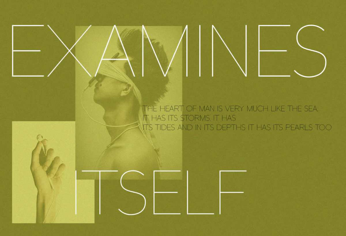
Typography isn’t just about picking a pretty font anymore.
With brands fighting harder than ever to stand out online, typography has become one of the most powerful tools in a designer’s arsenal.
But here’s the thing: choosing the right typography trend for your brand isn’t as simple as following what everyone else is doing.
You have to consider what message you’re trying to send, who you’re trying to reach, and how you want your brand to be perceived.
That’s why I’ve put together this massive guide to typography trends for 2025. We’re going to look at everything from the revival of classic serifs to experimental AI-resistant designs.
And I’m not just talking about a few basic trends here.
We’re diving deep into over 50 different typography trends that are shaping the design world right now. Some of these might surprise you. Others might be exactly what your brand needs to level up its visual game.
The best part? I’m not just going to tell you what’s trending. I’m going to show you why these trends matter and how you can actually use them in your designs.
Ready to discover what’s shaping typography in 2025?
Let’s dive in.
Classic With a Twist: Traditional Typography Gets an Update
Remember when everyone thought serifs were dead?
Well, 2025 is proving them wrong in a big way.
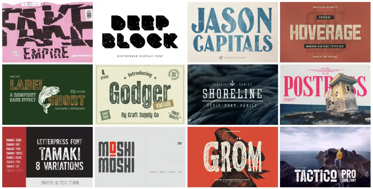
1. The Return of Serifs
After years of minimalist sans-serif dominance, serifs are making a dramatic comeback. But these aren’t your grandmother’s serif fonts.
Designers are taking classic serif styles and adding modern twists – think bolder strokes, unexpected angles, and even some experimental flourishes.
This isn’t just about nostalgia. It’s about finding that sweet spot between tradition and innovation.
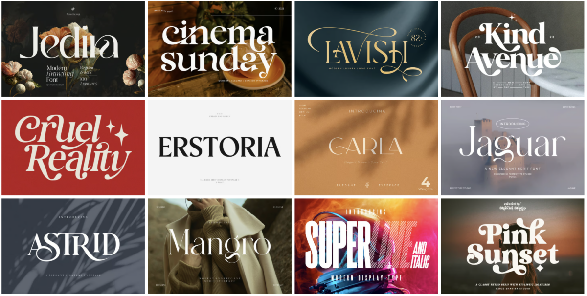
2. Elegant Royal Fonts
Luxury brands are falling in love with royal-inspired typography, and it’s easy to see why.
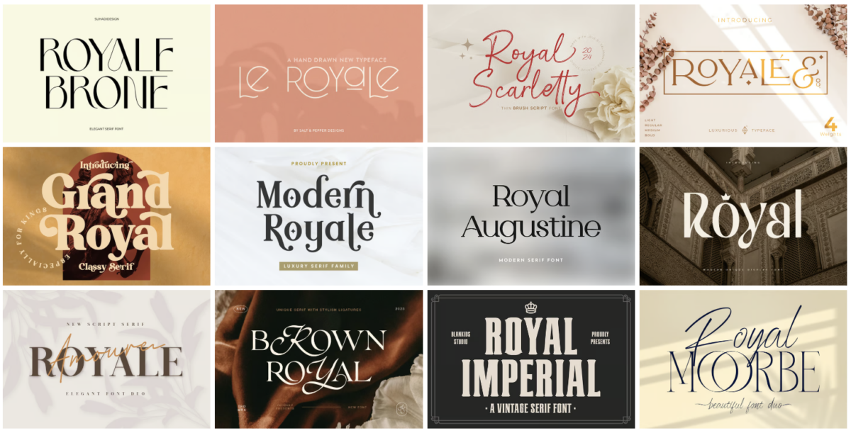
These fonts ooze sophistication with their regal curves and ornate details. But here’s the twist – designers are stripping away the stuffiness and adding contemporary elements.
The result? Typography that feels both timeless and fresh.
3. Transforming Serifs
This might be my favorite trend in this category.
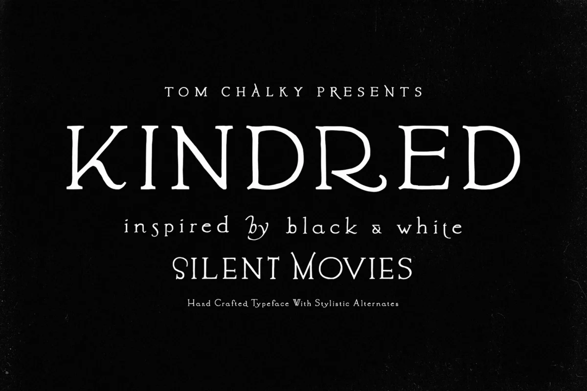
Designers are taking traditional serif fonts and morphing them in unexpected ways. Letters might start with a classic serif top and transform into something completely different by the bottom.
It’s like watching typography break free from its own rules.
4. Ultra-Thin Sans
Think minimalism is over? Think again.
Ultra-thin sans serif fonts are having a moment, but with a crucial difference. They’re being used in ways that actually make them readable – larger sizes, higher contrast backgrounds, and smarter spacing.
It’s minimalism that actually works.
5. Tall and Elongated Letters
Sometimes the simplest twist can make the biggest impact.
That’s exactly what’s happening with elongated letterforms. Designers are stretching traditional fonts vertically, creating dramatic silhouettes that command attention.
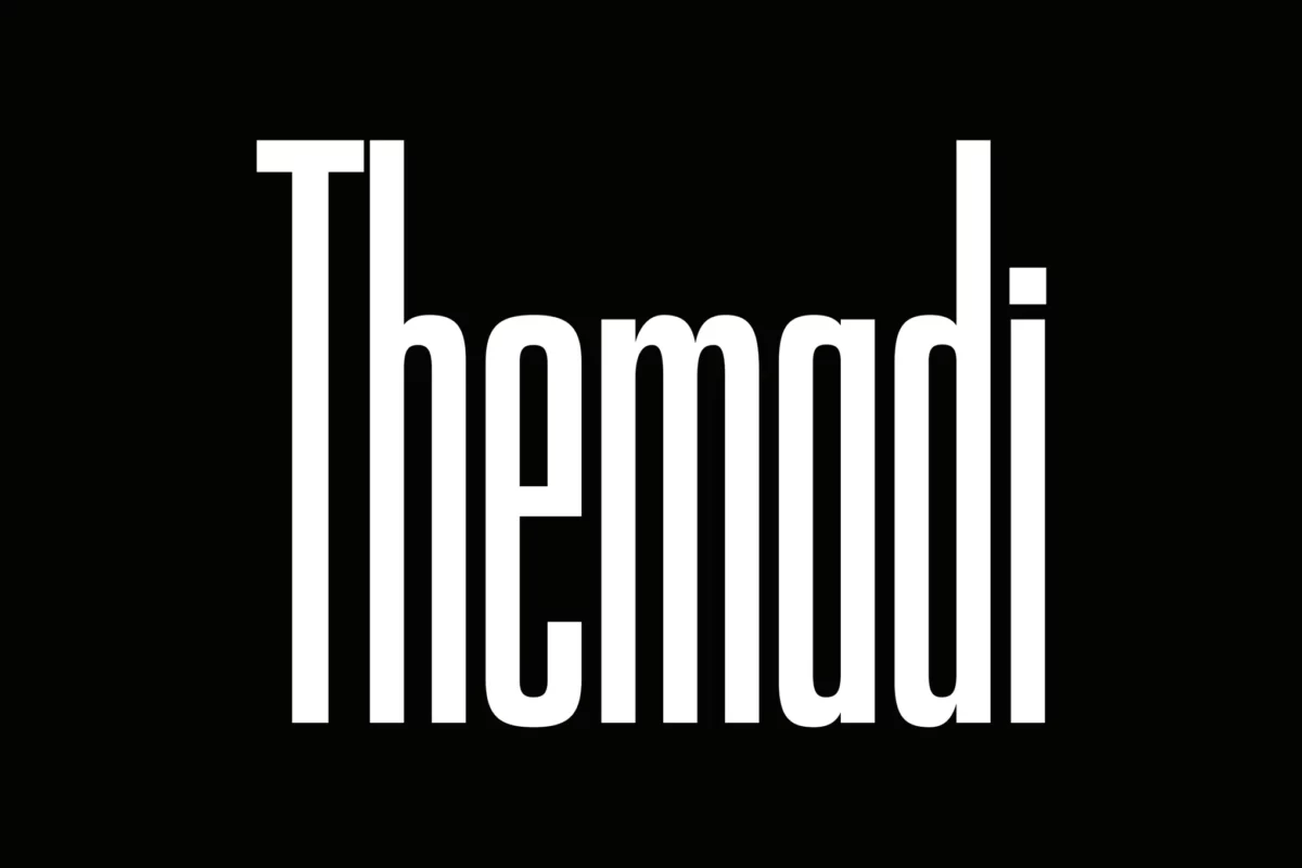
This trend works especially well for logos and headlines where you want to make a bold statement without getting too fancy.
The key to using any of these trends? Don’t just copy them blindly.
Think about how they align with your brand’s personality. A luxury skincare brand might rock those elegant royal fonts, while a modern tech company might get more mileage out of those transformed serifs.
Remember: the best typography choices are the ones that tell your brand’s story.